

Compelling, code-based data visualizations like those in The New York Times and FiveThirtyEight turn complex data into digestible information for the public.
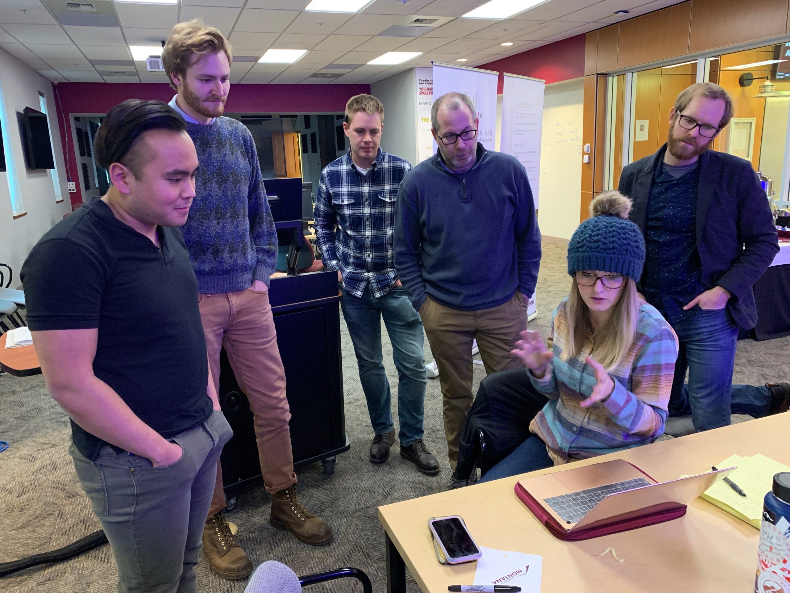
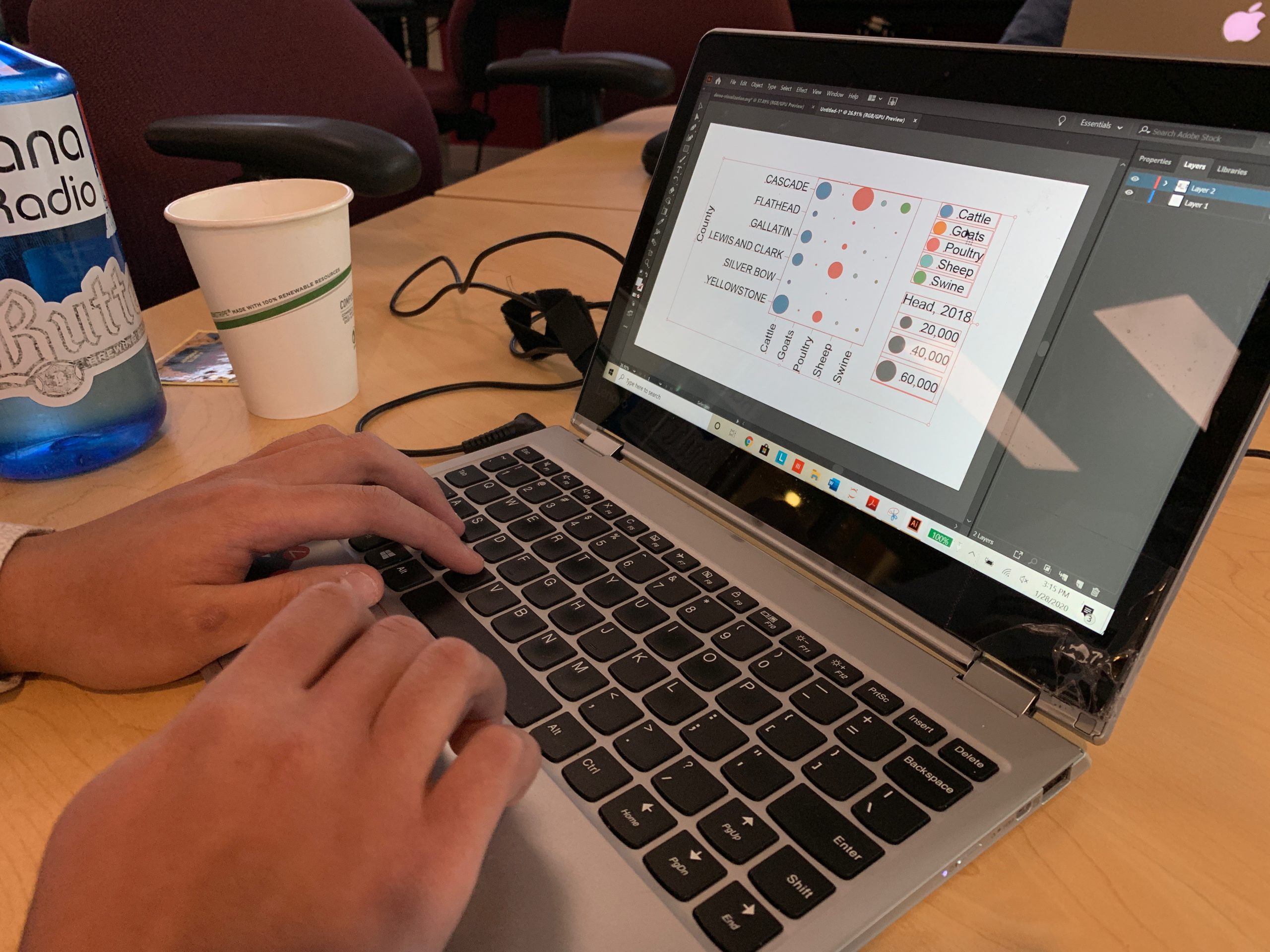
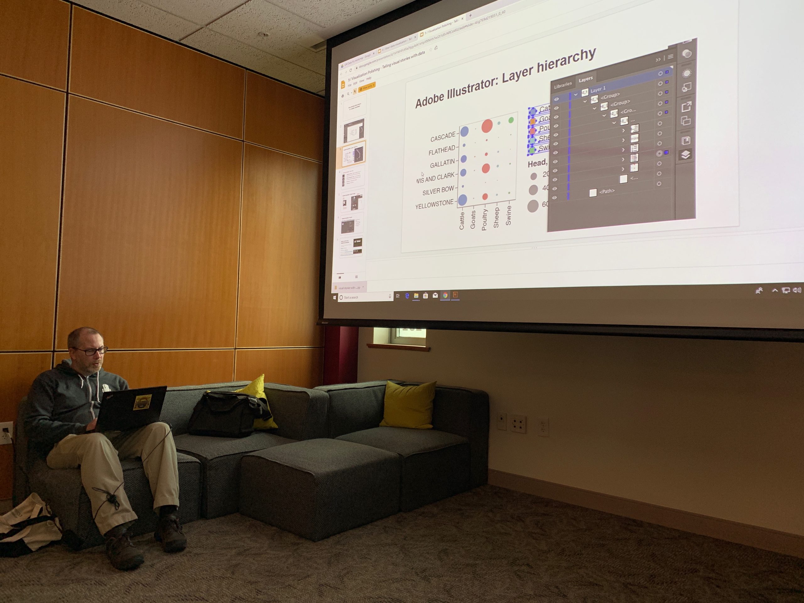
In January 2020, Montana Free Press data reporter Eric Dietrich hosted a two-day workshop at the Montana Media Lab to guide participants through his workflow for creating data visualizations. Participants learned to clean, visualize and annotate data to produce graphics using Google Sheets, the code-based visualization tool Vega and Adobe Illustrator.
Eric also introduced the Jupyter Lab environment for working with data using open source Python tools, and discussed how to combine data visualizations with narrative reporting and storytelling. The workshop culminated with attendees producing their own data visualization using a data set of their choice.
Want to see what’s coming up next at the Lab? Check out our upcoming workshops.

Learning data visualization techniques at the Montana Media Lab helped me add another tool to my storytelling toolbox. As a recent college graduate, I felt like I was learning skills that will help give depth to my work and stand out above the crowd.